Torq: the carsales brand and design system
Establishing an enterprise brand and design system that saved teams time and brought product, marketing, and brand together.
- Role
- Head of Design Systems
- Timeframe
- Aug 2022 to Dec 2025
- Team
- Led a multidisciplinary team
- Contribution
- System strategy, stakeholder engagement, team leadership, and hands-on execution
The challenge
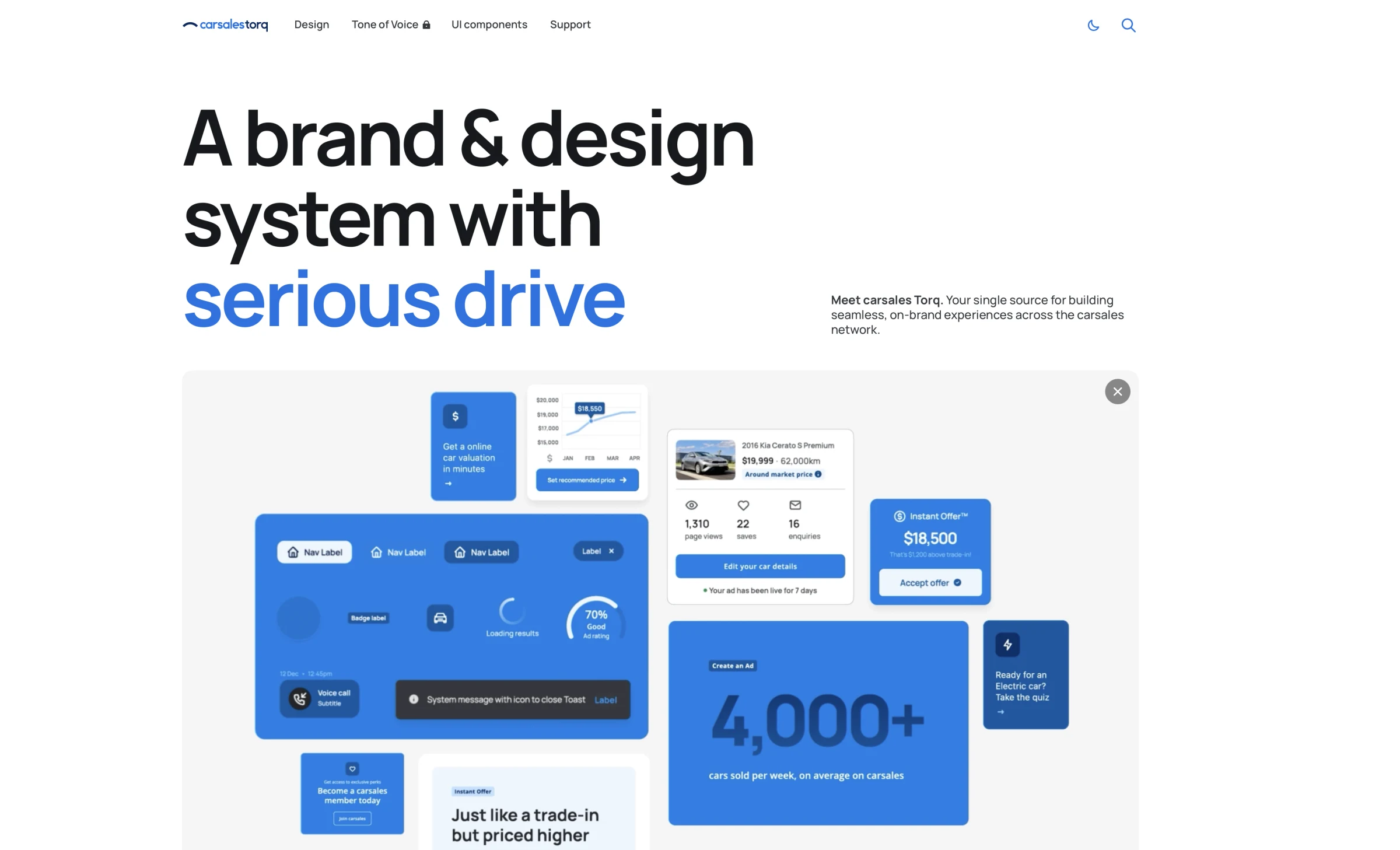
We established Torq as an enterprise brand and design system for carsales, connecting brand guidance with the foundations used to design and build products. It needed to span web, native apps, multiple brands, and different technology frameworks, while earning the support to become part of everyday delivery.
My role
As Head of Design Systems, I led a multidisciplinary team to establish Torq as the shared brand and design system, providing direction, stakeholder engagement, and hands-on support. Together, we shaped the strategy around user needs and connected product, marketing, and brand. My contributions included the Figma library, design guidelines, and token architecture developed with engineers.
Research and strategy
The team and I worked with teams across carsales to understand what they needed from Torq, where they needed flexibility, and what might make adoption difficult. Those findings shaped our priorities around a simple principle: using the system should be faster than building a custom solution. We built on existing adoption and prioritised new projects where integration was more straightforward. Documentation, training, support, and contribution paths were part of the strategy alongside components. For global expansion, our plan began with understanding local teams, technology stacks, and roadmaps.
A scalable token architecture
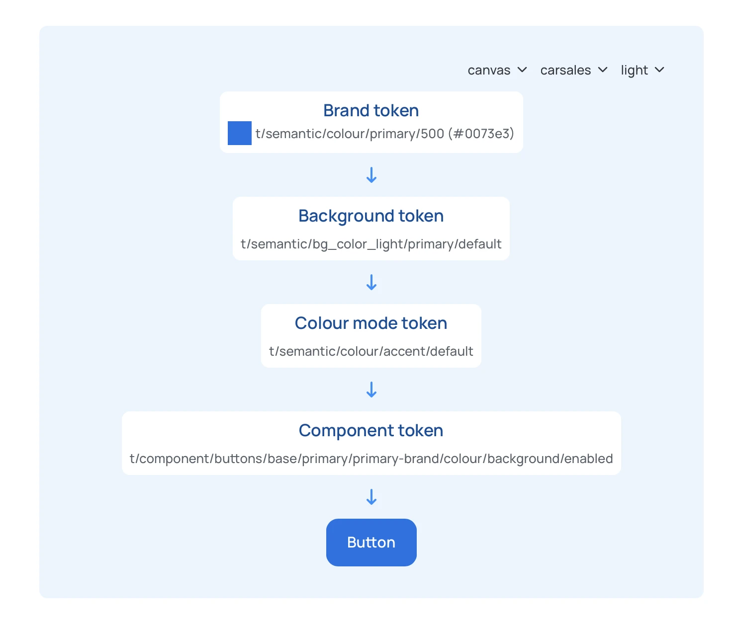
Working with developers, I helped establish a framework-agnostic token architecture spanning operating systems, web and native platforms, and sub-brands. Shared design decisions could be translated for different technologies without depending on one component library. We connected brand, background, colour-mode, and component tokens to support different contexts. A structured naming convention described each token’s tier, component group, component, and styling property, making the system easier to navigate and extend.
tSystemcomponentTierfeedbackComponent groupalertComponentborderCategoryradiusPropertydefaultScale
Colours that respond to their context
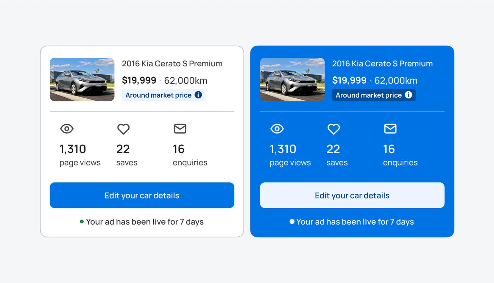
Our context-aware theming let elements such as buttons change colour according to their background, brand, and light or dark mode. Teams could reuse a component across surfaces without restyling it each time. I worked with developers to connect that visual behaviour to the architecture: brand values fed into background and colour-mode tokens, which informed the component tokens. The example below traces those relationships through to a button.
Libraries and guidelines for delivery
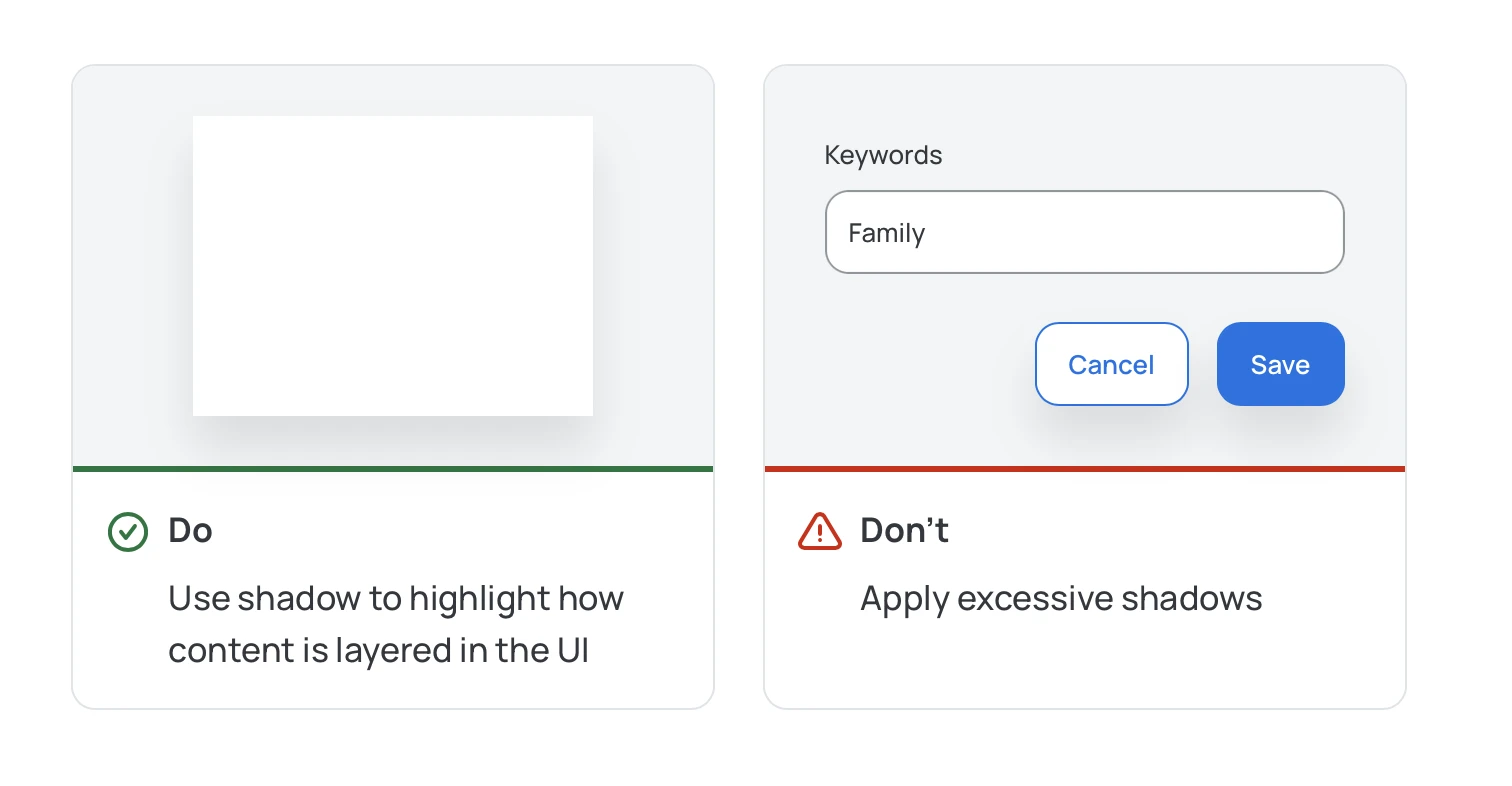
The team brought together a comprehensive Figma library, matching React components, and Torq’s documentation site. Shared building blocks connected design to implementation and reduced repeated work. Alongside contributing to the Figma library, I wrote extensive guidelines with practical examples of appropriate use and patterns to avoid. Our shadow guidance, for example, explained how to communicate layers without adding excessive shadows to individual controls.
Earning support
Early scepticism made stakeholder engagement essential. While the team made Torq useful in everyday delivery, I helped build support for their work. Staying close to execution connected those conversations to real team needs. Together, we earned strong buy-in.
Bringing product and marketing together
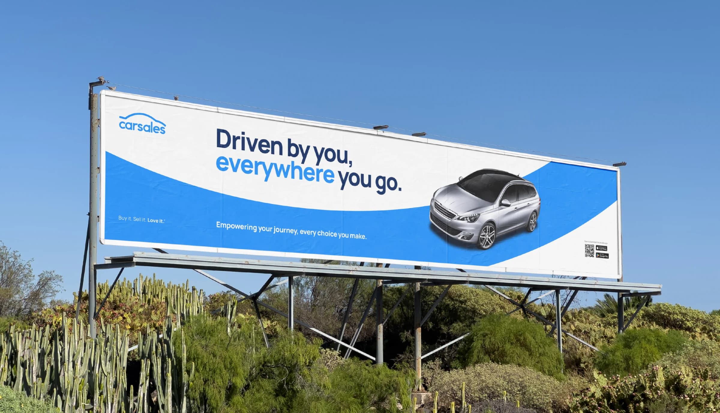
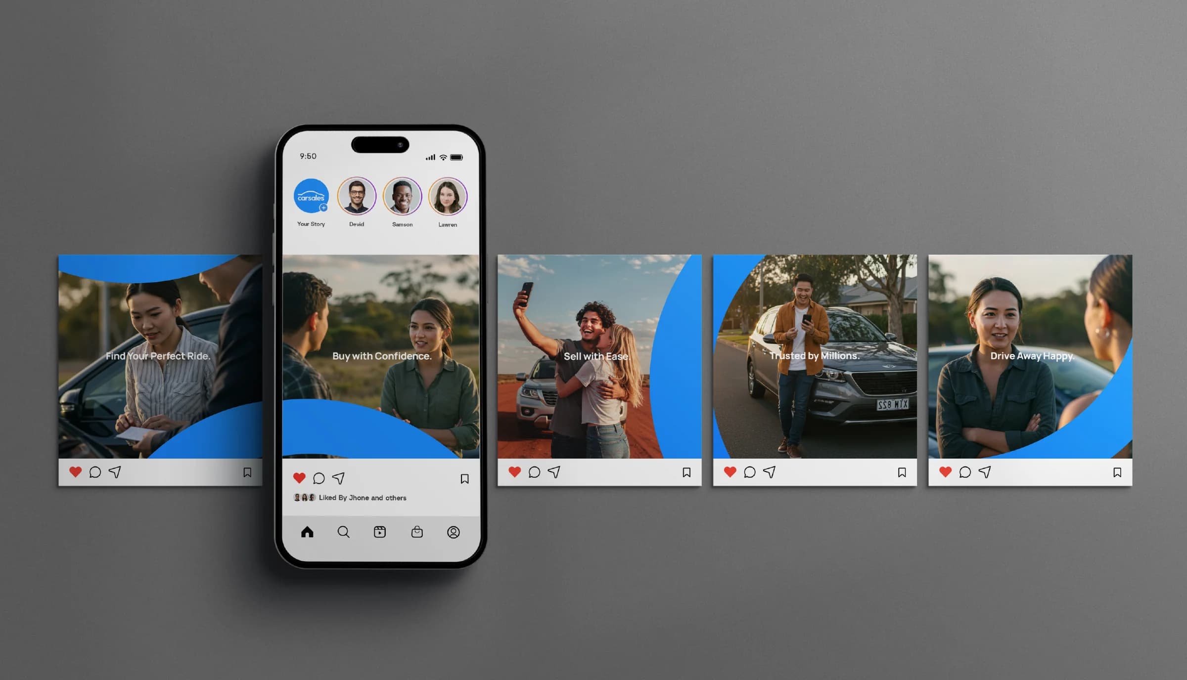
I helped bring product, marketing, and brand closer together so we could make Torq the brand and design system for carsales. Our collaboration made it the home for the new rebrand, connecting logo, typography, colour, the arc, and tone of voice with UI foundations. That gave the people shaping the brand and those building products a common source of truth for carsales experiences.
Results
We estimated more than 10,000 hours of design and development effort saved through component reuse. We multiplied the effort required to create each component by its production instances, then totalled the results across the system, using an approach similar to REA Group’s Construct Kit. The figure represents estimated effort avoided through reuse. Alongside those savings, Torq earned strong team support, brought product and marketing closer together, and became the shared home for the carsales rebrand. In 2025, Torq won a Good Design Award for digital interface design, plus Gold and Silver at the W3 Awards.