shadcncraft: React blocks and Figma kit for shadcn/ui
Helping teams assemble React apps faster with complete app starting points, reusable blocks, and matching Figma designs, built on shadcn/ui.
- Role
- Solo founder
- Timeframe
- Ongoing
- Team
- Contract developers and a branding consultant
- Contribution
- Business strategy, product, design, AI-assisted development, and growth
What is shadcn?
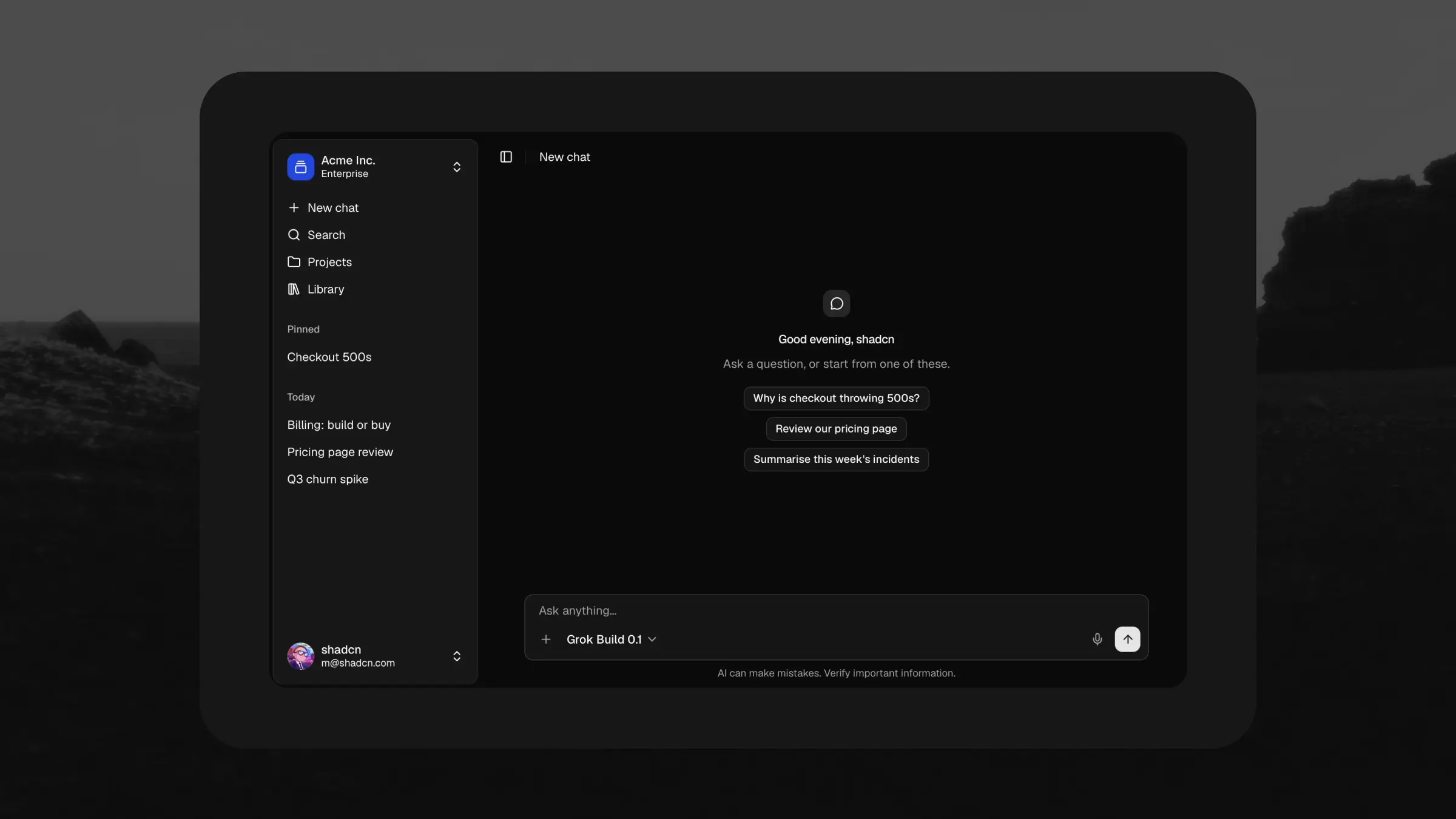
shadcn/ui is an open-source foundation for building interfaces, with components such as buttons, forms, and dialogs that teams can customise through their source code. The State of React 2025 survey identified it as the project with the fastest rise in usage, growing from 20% to 56% of respondents in two years. Vercel’s v0 uses it as its default component system, while shadcn’s MCP server lets tools such as Claude Code, Cursor, and Codex find and install components. shadcncraft builds on this foundation with a matching Figma kit, additional React components, reusable blocks, and complete app starting points.
My role
As a solo founder, I set shadcncraft’s direction and run the business behind it: strategy, P&L, marketing, advertising, and customer support. I design every app, block, and Figma component, build with AI-assisted development, and work alongside contract developers. A branding consultant helped establish the brand. In a given week I might plan the roadmap, refine a component variant, and write the marketing that explains its value. Owning both delivery and growth keeps product investment tied to what customers need.
The challenge
Teams building with shadcn/ui need more than primitive components. They still have to assemble buttons, inputs, and dialogs into layouts, flows, and applications. Repeating that work takes time away from their product. The challenge is to provide complete apps and reusable blocks that save meaningful work while remaining flexible enough for each team’s product and brand.
Starting closer to a finished app
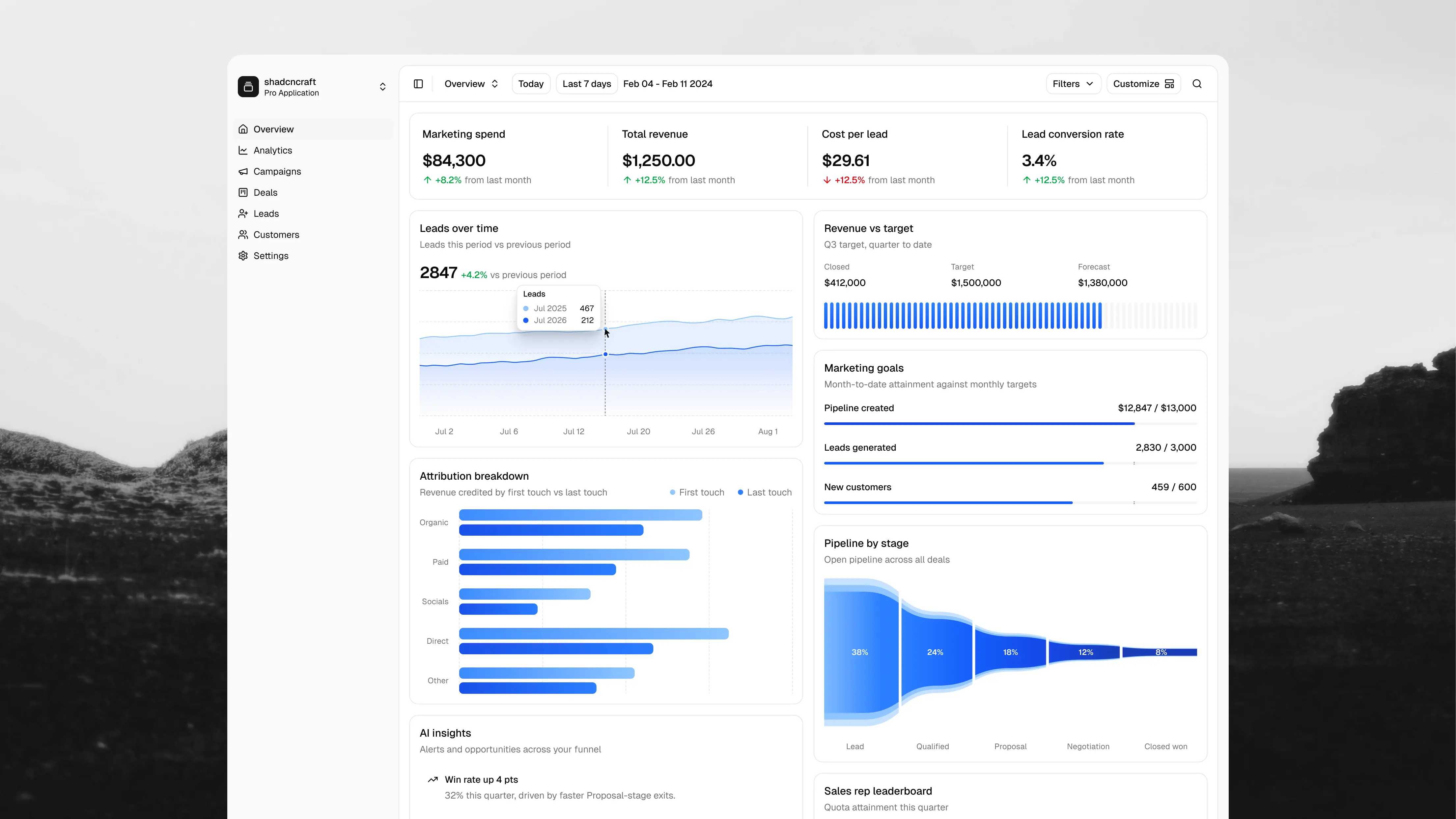
Teams can begin with a composed interface in React and Figma, adapt it, and focus on the features that make their application useful. The Sales & Marketing Dashboard is one example: seven pages in desktop and mobile layouts, supported by calendar, people, and coverage-planning components. Tables and AI chat blocks address other common product needs. These give teams a usable interface to build on, with structure already in place. The goal is to close the gap between choosing a component system and having an application interface ready for product-specific work.
Complete layouts, built to be adapted
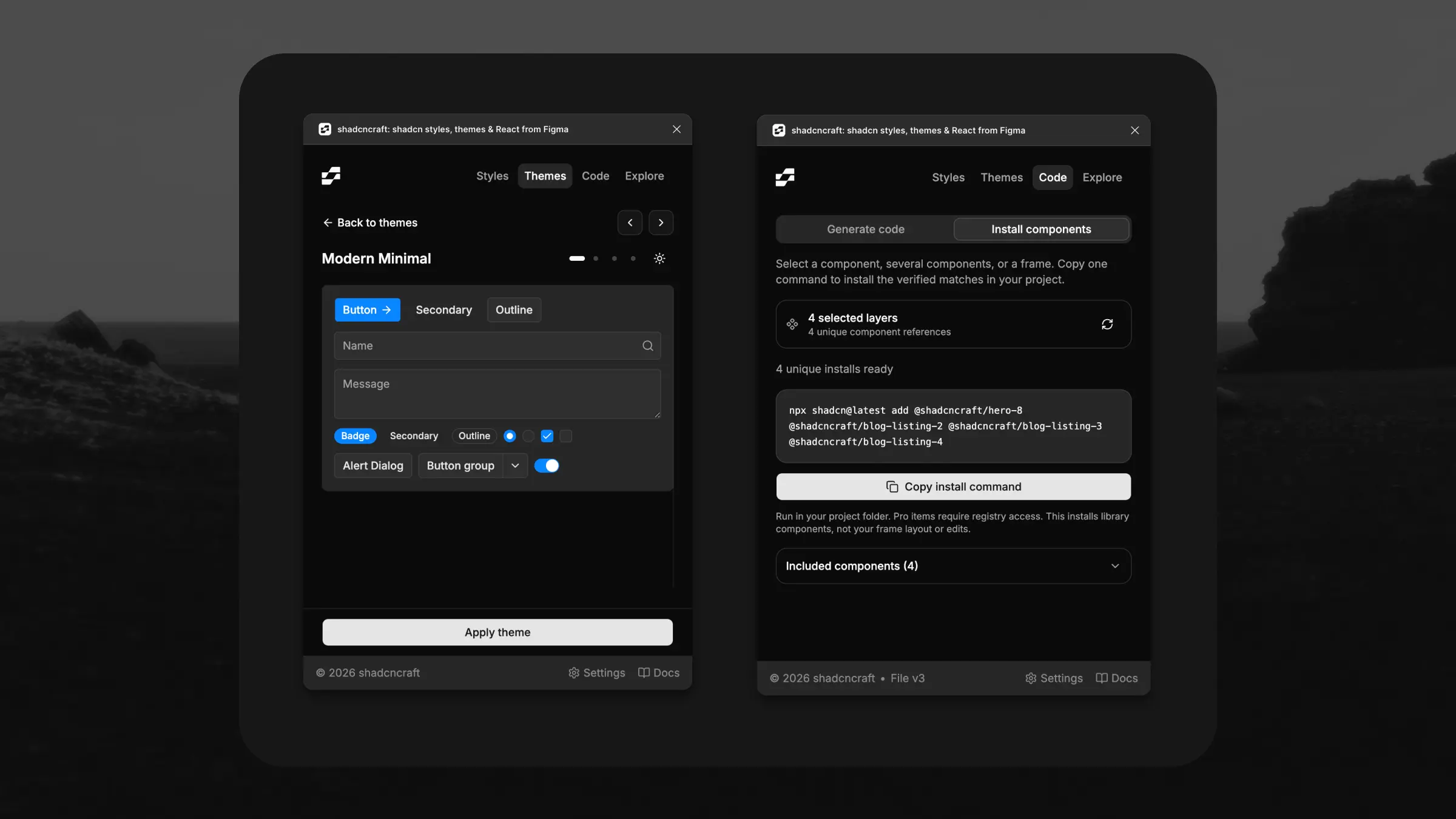
My work combines app and block design with deep, practical knowledge of shadcn: component composition, variants, design tokens, theming, and installation through the CLI and registry. Blocks need to function as complete interfaces while keeping their components reusable and customisable. The Figma kit supports eight starting styles, light and dark modes, and theme imports, so teams can apply their brand to the same structure.
“Beautifully done. Great job. A well-designed ecosystem of tools for building with shadcn/ui.”
Keeping Figma and React connected
I develop the Figma side alongside the React experience, working with contract developers to keep the connection precise. Figma component names match React exports, variant values map to props, and descriptions identify the corresponding code slots. Those conventions give designers and developers a shared vocabulary. Teams can explore and adapt layouts in Figma with a clear relationship to the implementation, preserving that connection as they make changes. I use AI-assisted development myself, keeping the design work grounded in the components and conventions developers actually use.
Working closely with customers
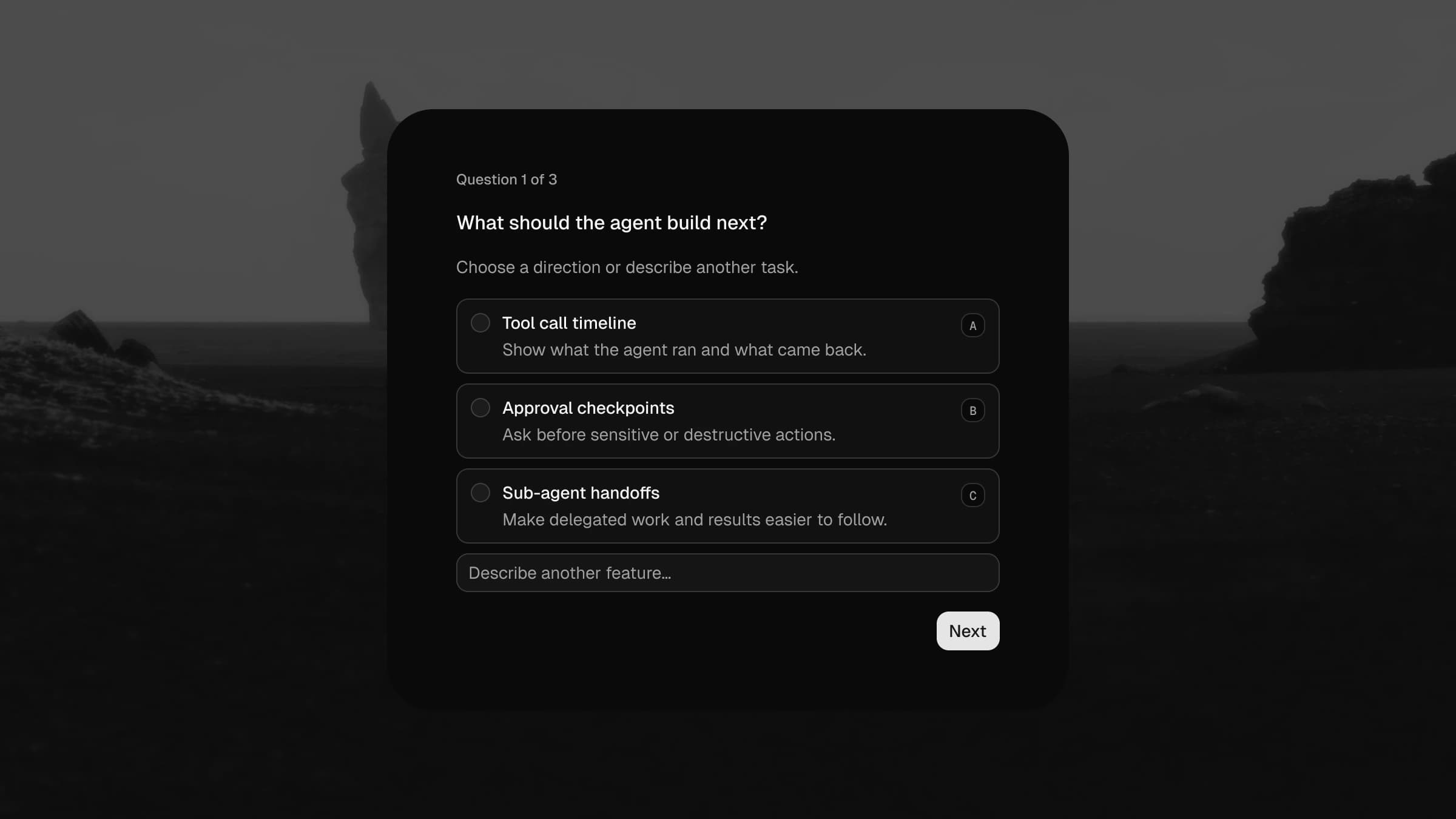
I handle support myself and work closely with teams using design systems, especially shadcn. Those conversations help me understand how they prototype, apply their brand, assemble interfaces, and move into implementation. Their feedback shapes ongoing development: more application components alongside website layouts, faster exploration in Figma, and custom themes that carry through light and dark modes. Staying close to that work helps me identify where the product can save teams more effort.
Supporting AI-assisted assembly
Agent skills and MCP support make our blocks and component conventions available to AI coding tools, helping agents find and use existing layouts and follow the system when assembling interfaces. Teams still connect their data, implement product behaviour, and review the result. The Figma plugin brings theme previews, component installation, and AI handoff into that workflow.
Results
I’ve grown shadcncraft into an ecosystem trusted by 16,000+ creators and teams across the Figma kit, plugin, and React products. Customers tell me they’re prototyping faster, applying their themes more easily, and spending less time assembling missing pieces. I continue developing the product around that feedback, helping teams spend more time on their own products.