UI Rules: design system rules for AI tools
Turning design system expertise into a product that helps teams build with their brand in AI tools.
- Role
- Solo founder
- Timeframe
- Ongoing
- Team
- Contract developers and a branding consultant
- Contribution
- Business strategy, product, design, AI-assisted development, and growth
What is UI Rules?
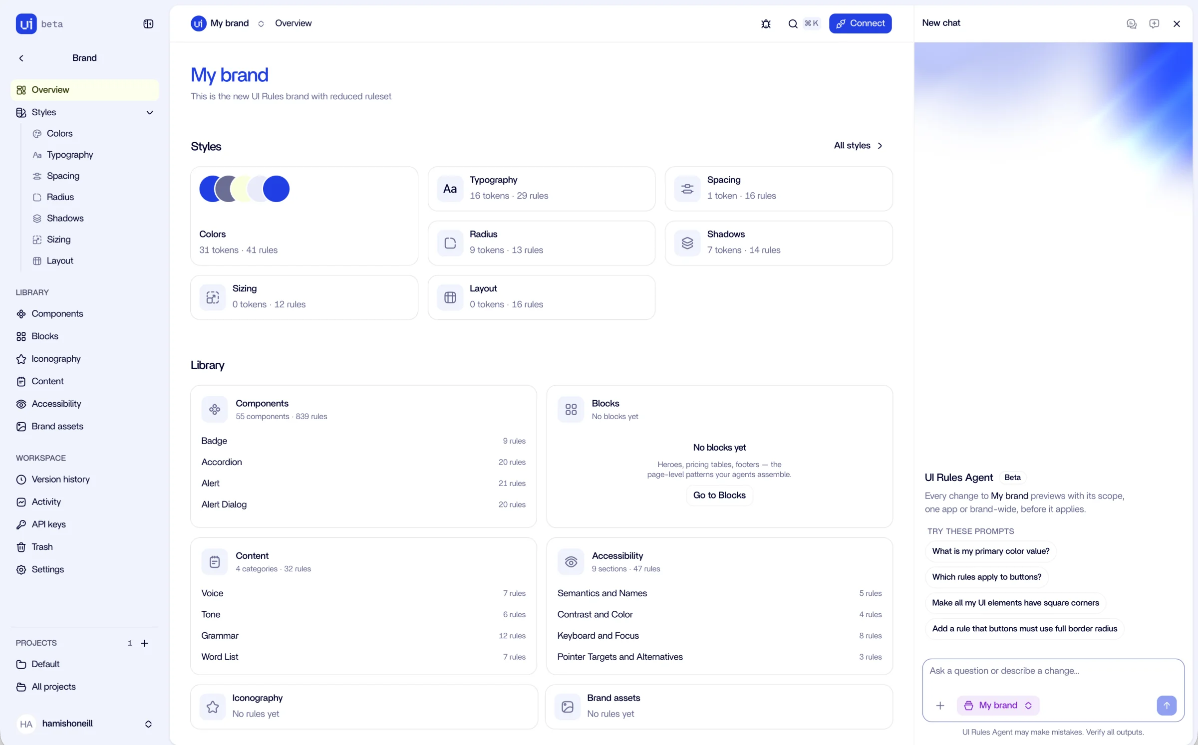
UI Rules connects a team’s brand and design system to the AI tools they use to build products. It brings design tokens, component guidance, accessibility rules, and voice and tone into one place. Tools retrieve that context through MCP, a standard for connecting AI applications to external tools and information. I founded UI Rules to make the decisions behind a good interface available at the moment it is being built. It draws on my experience leading design systems and helping teams put shared standards into everyday practice.
My role
As the solo founder, I run the business and lead the product: strategy, P&L, positioning, marketing, advertising, customer support, and all design. I build hands-on with AI-assisted development, work with contract developers on the core product, and led the branding work with a branding consultant. That gives me responsibility for the whole experience, from how people discover UI Rules to how they connect their tools and use it. Product and commercial decisions stay connected: can people understand the offer, get started, and find enough value to keep using it?
The challenge
Design decisions are spread across Figma, documentation, code, and people’s heads. An AI coding tool does not automatically have that context. Teams repeat instructions, correct generic styling, and explain the same conventions in each conversation. Switching tools creates another place to maintain those instructions. UI Rules provides a shared source that works across the tools teams already use.
Connecting the values to the decisions
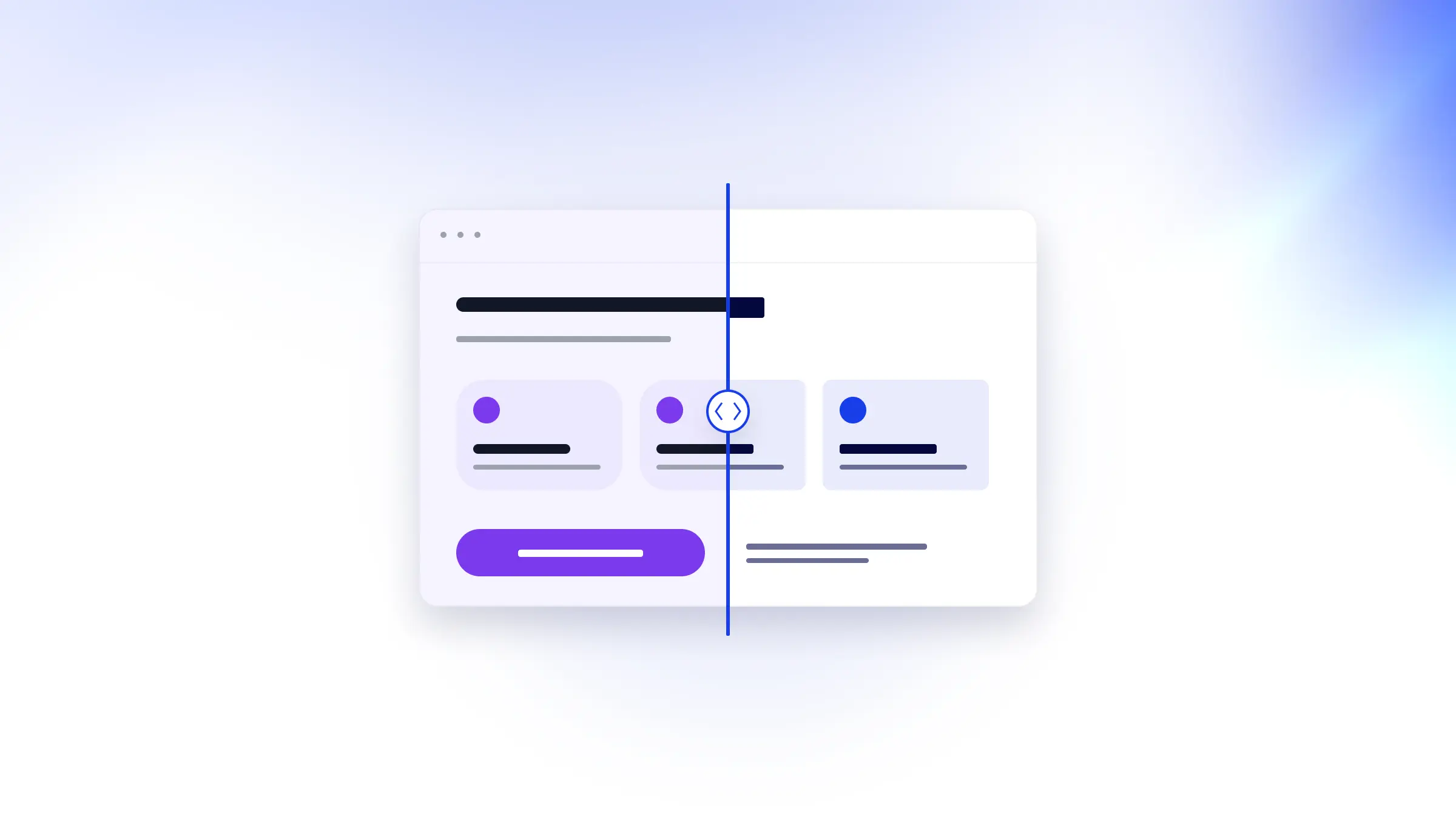
A colour token specifies a value. It does not explain which action deserves that colour, how many primary buttons belong on a screen, or what an error message should say. UI Rules keeps values and guidance together. Teams import styles from Figma or CSS and add rules with a rationale and priority: required, recommended, or optional. This makes design intent explicit for people and AI tools. The rationale matters: it preserves why a decision was made, alongside the instruction itself, so the guidance carries more than a visual specification.
Making expertise easier to use
Starter guidance covers visual design, accessibility, components, and content. Teams can adapt it to their system, placing rules beside the styles or components they govern. My design systems background helps turn broad advice into usable guidance. “Make the form accessible” is hard to apply consistently. “Keep the label visible when someone starts typing” gives the tool a concrete decision to follow.
“An easy way to describe your brand and styling across your whole business: the missing piece between the 'what' (tokens) and the 'how and why' that's so important, not just to AI, but to us squishy meat bags too.”
Keeping people in control
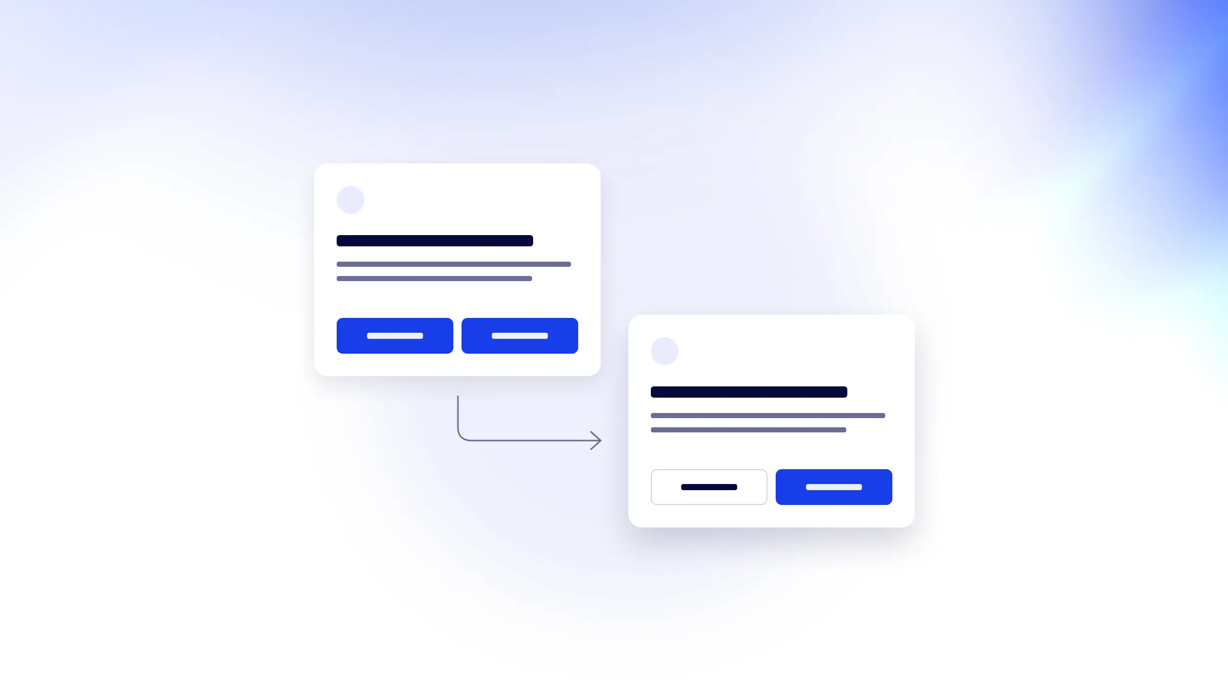
I designed the UI Rules Agent around describing changes in plain language and reviewing a proposal before anything is applied. A request such as “make the labels clearer” could mean wording, position, or both. The preview lets people check that interpretation. Style imports follow the same principle: show what will change, what already matches, and what is unsupported before committing.
Working across tools and teams
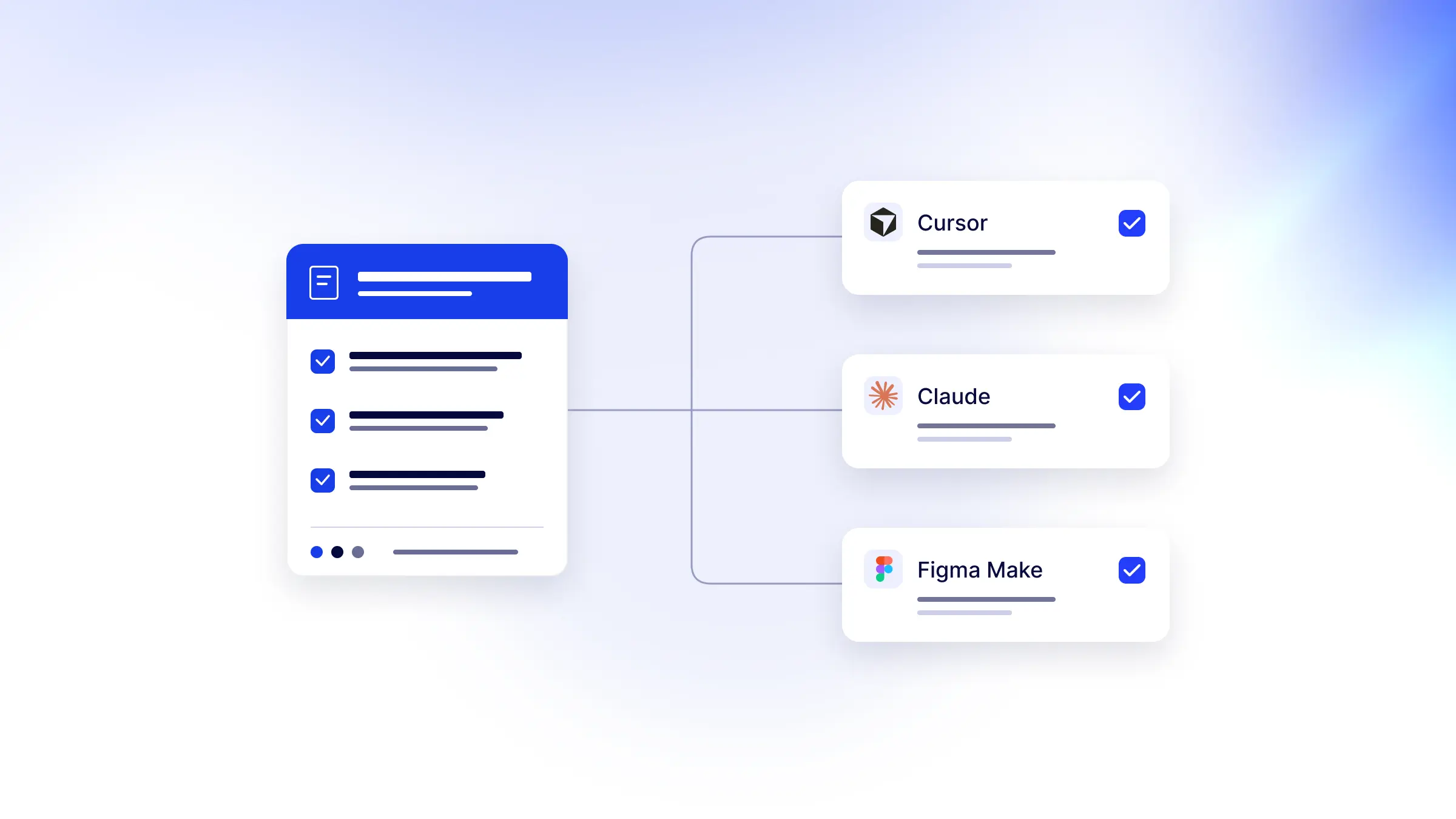
UI Rules connects to Cursor, Claude Code, Codex, Figma Make, v0, and Lovable. Inherited styles and deliberate project overrides let teams build different experiences under a shared brand. With contract developers, I continue improving the connection experience and core product. Recent work includes browser-based approval for supported tools, clearer import previews, and stylesheet checks against the expected token export. Those checks verify token delivery; usability and accessibility still need review in the finished interface.
Learning from designers and teams
I work closely with a group of designers and teams to understand how their brand comes through in AI-built experiences: how they describe it, where their guidance lives, and what their tools need to produce work that feels right. That research spans visual foundations, component behaviour, and product voice, as well as the path guidance takes to reach a tool through rules, tokens, and MCP. It shows me where AI tools can follow a system on their own and where teams still need to review the result.
Results
Hundreds of people are using UI Rules to bring their brand styles and design guidance into AI workflows. Early feedback highlights the value of keeping decisions together and giving tools the context behind them. I continue refining the product through customer conversations and usage data, focusing on making it easier to get started and put that guidance to work.